Conversion Optimisation
Stepstone is an industry-leading recruitment platform. Driving traffic to the business proved to be a financial strain, and although it generated 10 million weekly visits, it had been identified as a significant factor contributing to revenue loss. We needed to increase the conversion rate of the application form to drive this cost down.


Approach
Using existing research to speed up time to insight, we looked for pain points across the existing journey. We used quant and quantitative data, which was played back to stakeholders at regular intervals.
Observing Hotjar and with a heuristic analysis, the form was found to be challenging to navigate and in need of an update to its design to improve accessibility.

With the insights we gathered, we broke down the journey into three key stages: pre-application, application and post. Mapping out the user flows and marking where we had strong insights.

Working closely with Product managers, we utilised impact mapping. This became a crucial step when deciding on chosen solutions and played a big part in evaluating proposed solutions and user and A/B testing.

Challenge
A legacy application form, which would need to be rebuilt from scratch containing code over eight years old, added development complexity to the project and meant close collaboration with technical architects and engineering leads would be required.

User testing would need to be conducted in both German and English, requiring the use of an agency to speed up recruitment and synthesis of research.
A challenge was having to design twice as German copy at times came out significantly longer than English, requiring a rework of the proposals.

Outcome
Our research found issues in mobile applications being significantly lower, particularly in our German markets. We saw from interviews that they were concerned about data sharing, so this needed to feel secure, alongside a need to apply more formally on the desktop.
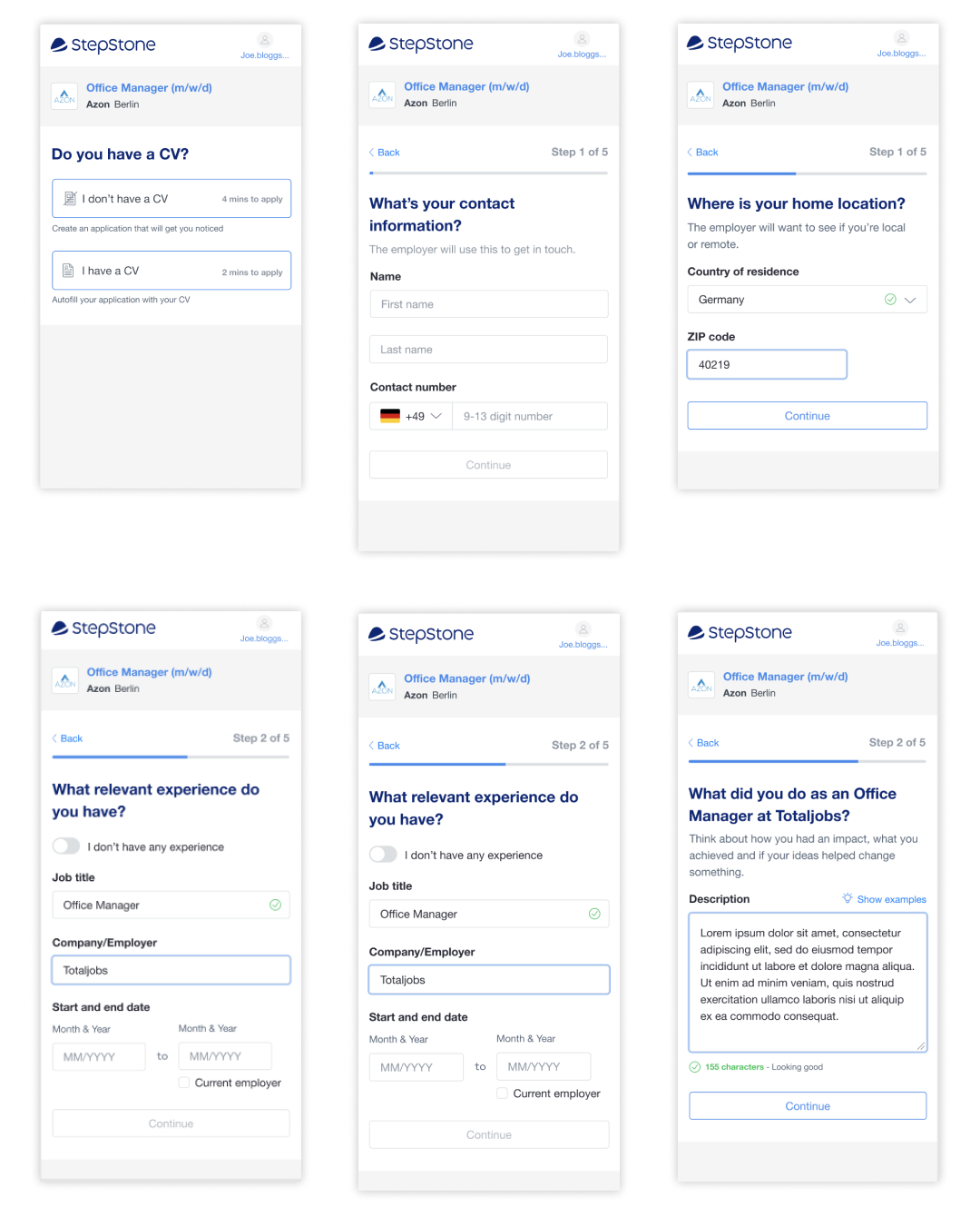
The CV was seen as a barrier to applying in the UK but from a fake door test, we found that the user base would be susceptible to applying without a CV, perhaps due to the user type being more blue-collar facing and a cultural difference in job application formalities.
We A/B tested button colours and copy and colour further up the funnel in the pre-application on the job description page, which resulted in an overall uplift of 15% (300K users per week) in button clicks. Naturally, this increased overall volume, but the form’s conversion remained the same.

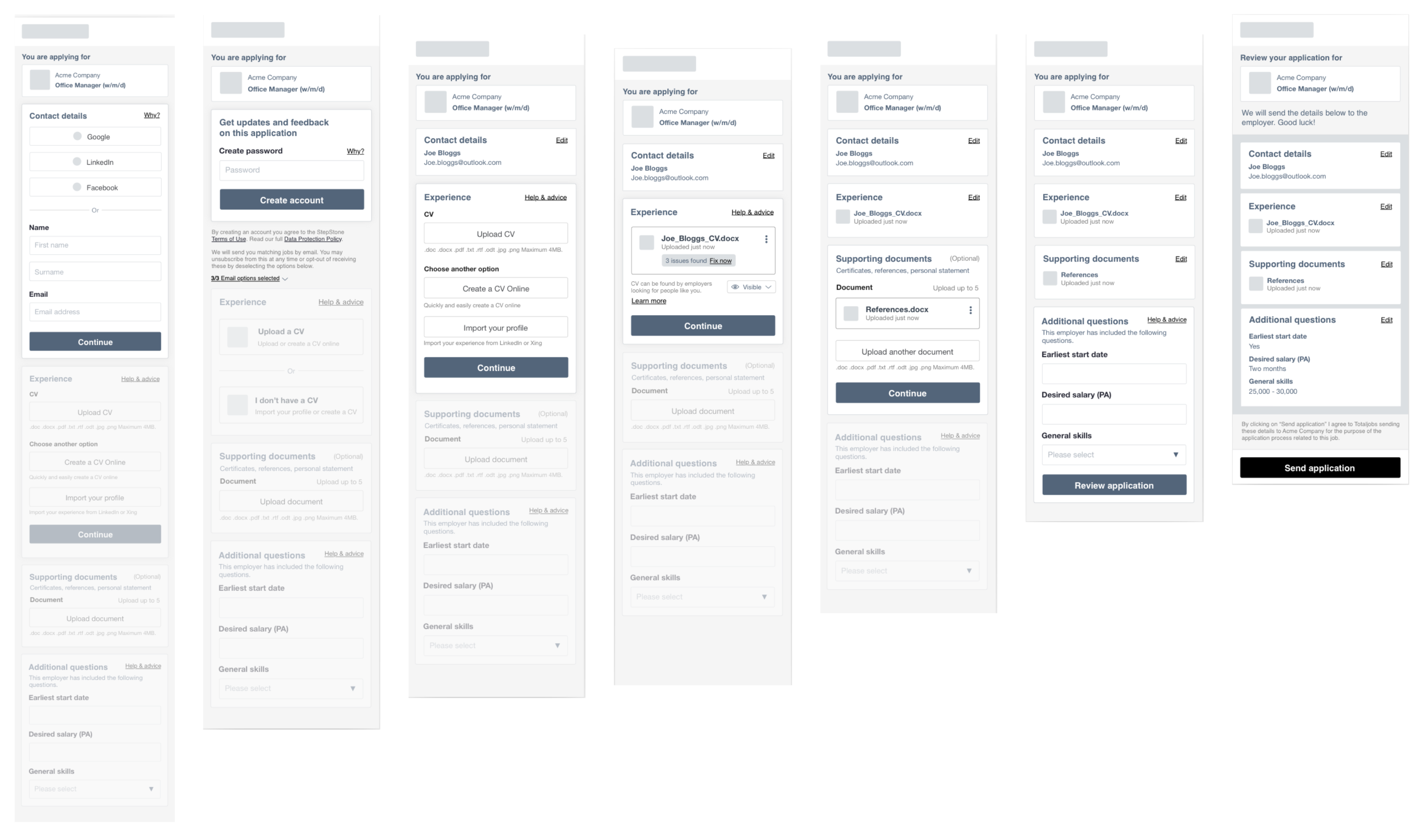
The form itself was broken down into sections providing social logins and asking for email addresses upfront to allow for abandoned basket emails to be sent, supporting the behaviour of starting an application on mobile and continuing on desktop.

Overall, the project was a success, and we saw an increase in the uplift of applications by 16.5% and increased registrations by 12% across our German and UK markets with an uplift of 18.6% in conversion from apply start to completion.
Reference


