Intranet Redesign
Sussex Partnership NHS Foundation Trust is a large public sector organisation that delivers mental health services to over a million patients annually. The organisation’s intranet was dated, and front-line services struggled to find the right information and systems needed to support them in their role.


Approach
I started by meticulously mapping the site structure, using Google Analytics to pinpoint crucial high-traffic areas. This gave me an initial sitemap and an indication of priority areas to work from.
I facilitated a closed card information architecture workshop. I ensured a fair representation from clinical and corporate delivery services to ascertain each identified area’s requirements and understand their unique needs and current frustrations.

As a part of the IA workshop, we identified the priority areas of the site and the top three critical use cases each of the areas would need to provide our users. This allowed sections of the intranet to be tailored to the unique needs of each department.

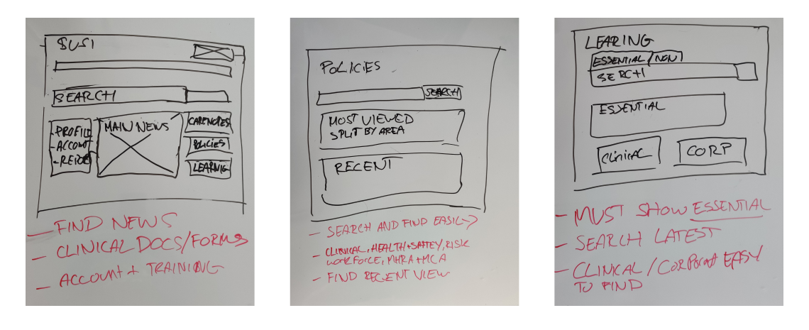
I drew up wireframes of the new homepage and key areas identified during the information architecture workshops. Not only did I need to improve the taxonomy of the platform, but I was updating the overall structure and functionality. These wireframes were then gorilla-tested with clinical and corporate users which helped to refine key areas such as quicklinks.

Challenge
Due to the intranet being twelve years old, staff were unable to find content. It had an outdated look, lacked overall structural management, and had only been given minor technical updates. This meant that staff struggled to not only find content but would more often than not be using out-of-date information.
We would also need to ensure the old site was still accessible due to the sensitive nature surrounding some of the content. Just because it wasn’t used frequently did not mean it wasn’t business-critical.
Gaining time for thorough insight gathering with front-line staff was difficult. Staff needed to see patients, so time was limited. A way I got around this was a feedback bar at launch, which we ran for the first month to gather more learnings and to assist in refining the platfrom.

Outcome
A redesigned site with updated content and a refined taxonomy. A higher focus was given to priority information and functions that we knew had large traffic volumes. The search was given an overhaul and the ability to filter results. .

Overall, the project was a success, and we saw an increase in the overall visits to the site use by 40% and a decrease in our support emails by over 20%.
Reference


