Product Vision
Elliptic is a blockchain analytics company focused on intelligence for organisations interacting with crypto. The product had grown organically over the last decade in response to market needs and, as such, needed to be more cohesive and aligned with the needs of its users.


Approach
Working with the Director of Research and Design, we reviewed existing interview recordings to extract insight into the core jobs to be done. This would give us a basis to identify our customers’ needs. One of the largest factors identified in this initial study was the need to quickly triage and come to a decision on suspected risk.
The current user flow and experience were then mapped out, and any areas of friction were highlighted. This was then played back to key business founders and stakeholders for early buy-in and feedback.

Wireframes were created that addressed the issues and reimagined the product around the newly identified jobs to be done. I introduced an alert model for better triaging a single view of risk aggregated around an actor on the blockchain and the ability to set disposition on suspected risk.

I user-tested the wireframes with five customers covering both crypto-native and traditional financial institutions. Overall, it shows that the proposal was on the right track and opened up conversations with participants about their frustrations with the current products.
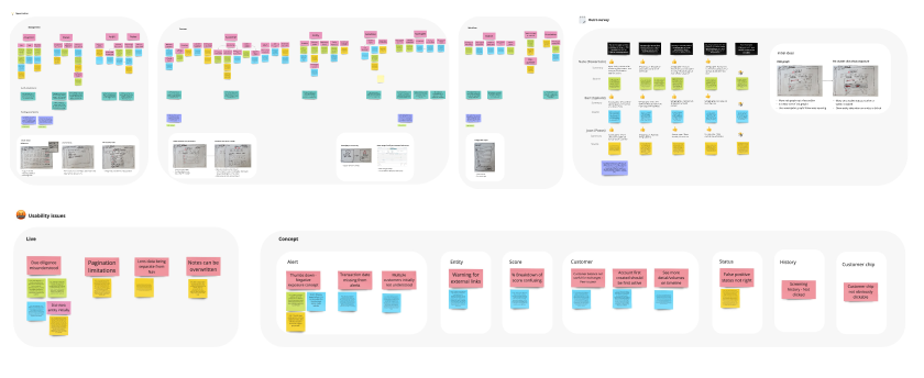
A key piece of insight that the proposal was found to be missing was a more detailed view of an actor, which was one of the biggest things that needed to be addressed. Using the new insight, I returned to our research repository and collected feedback from sales to understand this need better.

New wireframes were drawn up, which would then be retested with a greater focus on the actor view and the ability to audit actions taken within the product. The results showed an improvement on the initial proposal, with users quickly being able to come to a decision on suspected risk.

Challenge
Access to customers proved to be complicated. I improved relations with our customer service teams and kicked off a separate research community initiative drafted to grow a participant database. Subject matter experts were also used to help supplement the lack of users and speed up the time to insight.
Strategic buy-in was needed, which meant the work must be continually presented as part of an internal roadshow, and business leaders consulted and brought into the process early.
This project was being done alongside supporting road-mapped items. As such, a delicate balancing act was needed when it came to prioritisation in many cases slowing down the progress of the initiative.

Outcome
Initial tests showed that making the customer view more prominent on the page increased the number of visits to the area by 15 % and resulted in a 3-minute decrease in the time taken to change the status, adding further evidence to our assumption of the importance of a customer view when assessing risk.

Final mockups were drawn up, illustrating a Northstar product vision. This would be worked on by a third of the business’s development capacity for the new four quarters.
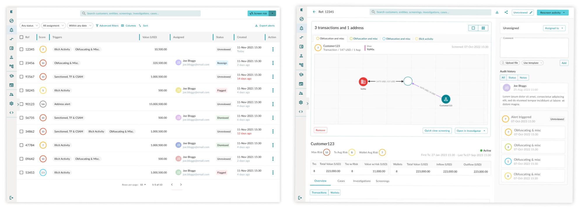
The work would be divided into separate initiatives consisting of a deeper and more detailed actor view, the ability to set the disposition of risk tied to a visible audit trial and greater system interoperability.
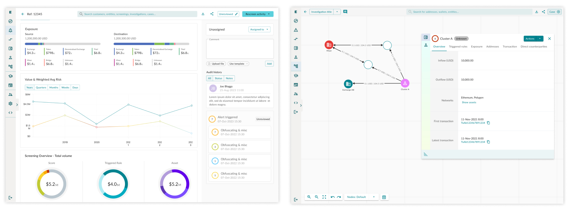
Dividing the work would make the development of the proposal more manageable and allow us to release value to our end users incrementally.

Overall, early testing and research efforts showed the potential success this project could have, and a significant proportion of engineering resources was assigned to the project over the next four quarters.
Reference


